
Landing pages are an essential component of any well-crafted, effective inbound marketing strategy.
They’re like landing pads for the numerous prospects that visit your website. Whether your goal is to generate leads, sell products, or collect data, your landing pages are where the action happens.
Well optimised landing pages allow you to take the prospects that you attract to your website and convert them into leads. Investing the time into creating well-designed and optimised landing pages is critical because they are your means for generating leads for your business.
With the growing challenge of attracting and holding people’s attention online, it’s more important than ever to design your landing pages to trigger instant conversions. Without a landing page, you won’t be able to gather information about the people visiting your website, which will make it very difficult to understand them, market to them, nurture them, determine how fit they are for your product or service, and ultimately convert them into paying customers.
So, to generate as many leads as you can for your business, it’s crucial that your landing pages are planned, designed, executed, and always working correctly. Optimising your landing pages ensures that first-time and repeat visitors will see the information they need to make purchases and eventually become your brand advocates.
This guide will give you the landing page knowledge you need so you can start boosting your site conversions today. Ready to get started?
- What is a Landing Page?
- Why Use Landing Pages?
- The Anatomy of an Optimised Landing Page
- A/B Testing Your Landing Pages
- Measure the Performance of a Landing Page
1. What Is a Landing Page?
Let’s get the basics out of the way. What exactly is a landing page?
A landing page is a website page specifically designed to convert visitors into leads.
It allows you to capture a visitor’s information through a lead capture form. It’s where your prospects “land” after clicking through on marketing links and calls-to-action. The lead capture form is where prospects can fill in their information (like name, email address, and so on) so you can drive them through the appropriate marketing and sales funnels and (hopefully) turn them into customers.
Here’s an example:

A good landing page will target a particular audience, such as traffic from an email campaign promoting a particular ebook, or visitors who click on a pay-per-click ad promoting a specific campaign. So it’s important to build a unique landing page for each of the offers you create. You can build landing pages that allow visitors to download your content offers (ebooks, white papers, webinars, and so on), or sign up for offers like free trials or demos of your product.
Outstanding landing pages will help you convert a higher percentage of your website visitors into sales.
They make the process of receiving an offer much simpler for your visitors because your visitors don’t have to navigate your website to find the page they’re looking for. Sending your visitors to well designed landing pages also eliminates any confusion about what they must do to receive your offer, which keeps them from getting frustrated about not finding the form, or deciding that it’s not worth their time to figure out how to go about the process.
You must keep your audience in mind when creating every aspect, from the headline to the button copy. Do you know what makes your buyers tick? Do they want to see bold declarations or absolute fact? Would they prefer clean, minimal design?

Or something more bright and fun?

The copy you use should also be crafted specifically for the readers whom you want to convert into leads. The tone, clarity, and focus of your words is so important.
Other elements crucial to a successful landing page include an eye-catching header, compelling content, and button copy that invites a click. Landing pages should not include navigation to other pages on your site, which may distract them from your main call-to-action. Once a prospect “lands,” you don’t want them going anywhere else without filling out that form.
Each landing page should have a unique design that matches other marketing materials used for that specific offer. The branding, imagery, and positioning should align. For instance, your PPC ad should include the same title, subtitle, and summary as the landing page’s, as well as any image that might be included. The same is true for the blog or article you post to launch the offer, emails you send, and the thank-you emails you send after the form is completed. The is the #1 way to avoid possible confusion, which could lead to a prospect navigating away.
2. Why Use Landing Pages?
Your landing pages play a critical role in driving leads and revenue. Aside from simply collecting the names and contact information of those who are interested in your company and products or services, your landing pages also provide several other impressive benefits. With careful attention to design and copy, you can take your lead generation to the next level. So, what are those benefits?
1. Lead Intelligence
While a person’s first visit may require only a name and an email address, subsequent visits can give you deeper insight into the buyers who are interested in what you have to offer.
You can also leverage the power of context by adjusting your forms’ questions and length based on whether a visitor has already completed one of your forms in the past. This is called progressive profiling. With progressive profiling, every time a lead fills out a form, you are progressively collecting valuable new information about them while keeping your forms short and easy to complete. This enables you to build up the amount of information, or intelligence, you collect about your individual leads without causing more friction in the conversion process.
Everything you learn will help you segment your contact lists, nurture those buyers through every part of the buyer’s journey, and provide relevant content before, during, and after the sale. In other words, the more you know, the better you can sell to them.
2. Site SEO Boost
Every time you publish a new landing page, you’re adding one more indexed page on your website, which means it’s one more opportunity for you to show up in search engines and drive traffic to your website via organic search.
When you create landing pages that are “search-friendly” or “SEO-friendly,” you’re increasing the likelihood that your gated offers will be found by people who are interested in your content. Folks who find landing pages through search engines tend to convert at a higher rate because they’re already actively looking for information on the topic your offer covers.
A “search-friendly” or “SEO-friendly” landing page means you’ve optimised the title, headlines, URL, and other parts of the page for a target keyword to tell Google to rank that page for that target keyword. When your content is planned based on keyword research and demand, your landing pages are sure to be found. The more you’re found, the higher you rank; and the higher you rank, the more you’re found!
[Check out the landing page above live here.]
Not only will you continue to see traffic driven to your site through both organic and paid searches, you’ll also boost your website’s authority. Because those searches aren’t likely to stop, you’ll continue to enjoy traffic to your landing pages and an increase in leads (and revenue) without additional work.
3. Maintain Lead Flow
As you might expect, the more landing pages you have on your website, the more leads you will generate. This, of course, means that you must create more offers and launch more events so you have landing pages to direct your customers to. More landing pages bring in more leads, and optimised landing pages will see better conversion rates. With a landing page that has been customized to the specific needs of your buyers, the sky is the limit.
4. Long-Tail Lead Benefits
While you may use some of your landing pages for one-off events such as product launches or big discounts, the bread and butter of your lead generation content should be evergreen content.
Evergreen content means content offers that stays useful season to season, year after year, with little or no upkeep. It’s content that’s timeless, valuable, in-depth, and high quality. These are things like how-to guides, tutorials, resource lists, answers to industry FAQs, historical accounts, or your company’s stance on an issue.
Even as you continue to produce more offers and launch more products and services, those landing pages remain in place, continuously drawing in leads for as long as you need them – for years to come.
5. Prospect & Lead Engagement
In addition to learning all you can about your prospects through your landing page forms, you also have the ability to discover which of your prospects are the most engaged. That first conversion is always exciting, but what about those customers who come back again and again for various offers and product launches? Those are the folks your sales team wants to talk to.
Your landing pages give you the ability to track your return site visitors – even those who haven’t yet made a purchase. By learning which of your offers these folks have downloaded and which of your launches they’ve followed, you can gauge their location in the buyer’s journey.
The buyer’s journey is the active research process a potential buyer goes through leading up to a purchase. Are they still gathering general information, or have they moved on to the content in the consideration phase? Are they still considering, or have they begun to investigate free trials, demos, or another bottom of the funnel offer?
The more intelligence your sales team has, the better they can provide the solutions your prospects need. They’ll know what your buyer is looking for and when, exactly, they’re primed to buy.
6. Fuel for Other Marketing Channels
As powerful as your landing pages are, they’re not the only tools in your inbound marketing toolbox. You still rely on your blog, pay-per-click campaigns, email campaigns, and social media efforts to drive traffic to your website and keep your prospects engaged.
An offer or event launch that leads to a landing page gives you plenty to share through your various marketing channels. When used in your marketing and lead nurturing campaigns, your landing pages will see even higher traffic, engagement, and conversions.
Even better, when you use evergreen content in your offers, you always have something to share. Your older offers will still bring in leads and engagement on your social sharing sites.
7. Insight Into Your Marketing Effectiveness
The more landing pages you create, the more data you’ll amass for your marketing efforts. Tracking and analysing the metrics associated with your landing pages helps you learn what’s working and what isn’t. You’ll also learn:
- How your various offers compare with one another;
- How visitors and leads convert on your landing pages;
- How your landing pages drive business revenue;
- Which landing page elements you should test for better optimisation.
There is always room to improve your efforts, but you can’t make changes for the better if you don’t know which elements of your landing pages and overall marketing plan need additional attention.
Before we get into testing, let’s talk about what an optimised landing page actually looks like.
3. The Anatomy of an Optimised Landing Page
Now that you know the importance of landing pages and how they can help to boost your bottom line, the next question is: How do you optimise your landing pages so they do everything they promise to do?
In this chapter, let’s go through all the landing page design essentials and show you best practices for each.
The Key Components
Let’s dissect a landing page together to learn about the various elements every landing page should have, from the headline to the submit button.
1. No Navigation
Once visitors land on your page, you don’t want them to leave until they hand over that information and receive your offer. For that reason, it’s important to keep your navigation options to a minimum. Hide top and side navigation bars from the site so that nothing distracts them from completing the form
These visitors landed on your site for a reason: to receive the offer your promoted. You’re actually doing them a favor by removing the distractions of links to other pages until they’re able to receive your offer – and you’re doing yourself a favor by reducing your landing page’s bounce rate.

2. Clear, Concise Headline and Subheading
The headline is the first thing visitors will see when they land on your page. Whether they stay and engage or navigate away could depend entirely on what your headline says. That’s why it’s critical that you have a clear and concise headline. It should state your offer as clearly as possible. Tell visitors what kind of ebook or workshop or demo they’re signing up for, how much the discount is for, or what product you’re launching. The more information you provide in the headline, the more likely you’ll convert interested prospects.
Here are a few examples of clear, concise headlines:
- “Sign up for your free account”
- “Work Smarter with Evernote: Online Workshop”
- “Get our tips straight to your inbox and become a better manager.”
A subheading under your main headline can provide more information about the benefits of your offer. This also serves as your landing page’s value proposition: What does this offer bring to your buyers that they can’t get anywhere else? What makes it valuable to your visitor? You can’t fit all of that information into a headline, so fortunately, you get a second chance.
Here are a few examples of headlines with great subheaders:
- “The Conversion Collection: Generate Even More Leads From Your Blog”
- “Money Matters: Your Guide for Financial Security”
- “Get a Free Strategic Analysis of Your SEO & Content Marketing”
- “Watch a demo of HubSpot’s software: See how you can increase your company’s revenue with our all-in-one marketing platform.”
- “Learn the science behind the art of winemaking: Fill out this form and we’ll enroll you in a free sample lesson on sparkling wine”

3. Value Statements
While your headline and a subheader should give visitors a pretty great idea of the value of your offer, for some visitors, those alone won’t be enough to motivate them to fill in their contact information on a form. A few sentences or bullet points that clearly state what the offer includes and why it’s valuable could make all the difference here.
In a brief and clear list, anticipate and answer any questions visitors might have about the offer. What does your visitor stand to gain from the offer? Will they learn more about your services? Does your offer teach them various ways to use your product? Can they save money or receive a free trial?
Be sure that you break up large blocks of text and use bullet points to draw eyes to the most important takeaways.

4. Relevant Image
In addition to creating a great offer and writing a great headline and value statements, compelling imagery will help you grab your visitors’ attention. After all, a picture says a thousand words. Of course, that image should be relevant and match the offer so that buyers aren’t confused by the final asset.
A great image for your offer might be the cover image of your ebook, a screenshot of the webinar or video, or a graphic design stating the discount or sale available. This gives landing page visitors something visual to match the text they read. That image will stick with them longer than any of the copy.


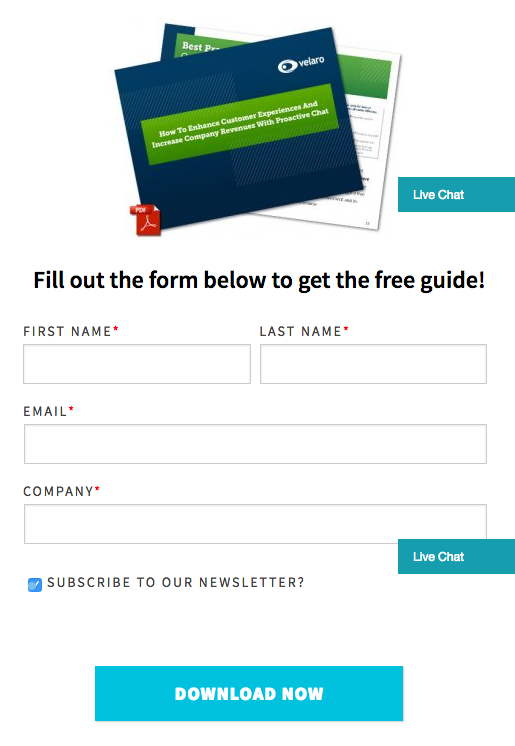
5. Lead Capture Form
The lead capture form is without a doubt the most crucial element of your landing page.
Your form is how your visitors will supply information in exchange for your offer. Without this form, you cannot collect the necessary data that helps you market to potential buyers.

Naturally as marketers or salespeople, we want to ask for lots of information from visitors. Visitors, on the other hand, want to spend as little time as possible filling out the landing page to get access to the offer they’re trying to get. That means the number of fields on a landing page is a balancing act between user experience and business needs.
The length of your form also inevitably leads to a tradeoff between the quantity and quality of the leads you generate. A shorter form usually means more people will be willing to fill it out, so you’ll generate more leads. But the quality of the leads will be higher when visitors are willing to fill out more forms fields and provide you with more information about themselves and what they’re looking for. Therefore, shorter forms usually result in more leads, and longer forms will result in fewer, but higher quality leads.
It all boils down to your goals: If your priority is more leads regardless of quality, then minimize the number of form fields. If your priority is more high quality leads, then ask for the specific information that your sales reps need to qualify your leads.Free Lead Goal Calculator for Marketing & Sales Teams
Remember the progressive profiling we talked about in Chapter 2? If you have marketing software that lets you adjust your forms’ questions and length based on whether a visitor has already completed a form of yours in the past (like HubSpot’s does), you’ll be able to progressively collect valuable new information while keeping your forms short and easy to complete.
So a first-time visitor might see this form:

But a returning visitor might see this form:

If you want to learn more about progressive profiling, read this HubSpot blog post.
6. Privacy Policy
Any time you request contact information from a visitor to your website, you should provide an explanation about how you plan to use email addresses and phone numbers. It’s just the right thing to do. After all, it’s not at all unheard of for unscrupulous companies to sell people’s information to the highest bidder.
Lack of a privacy policy could discourage visitors from filling out your forms. Include a short line or two reassuring visitors that you won’t sell their information:

Even a simple link to your privacy policy, could be enough to give your prospects some peace of mind:
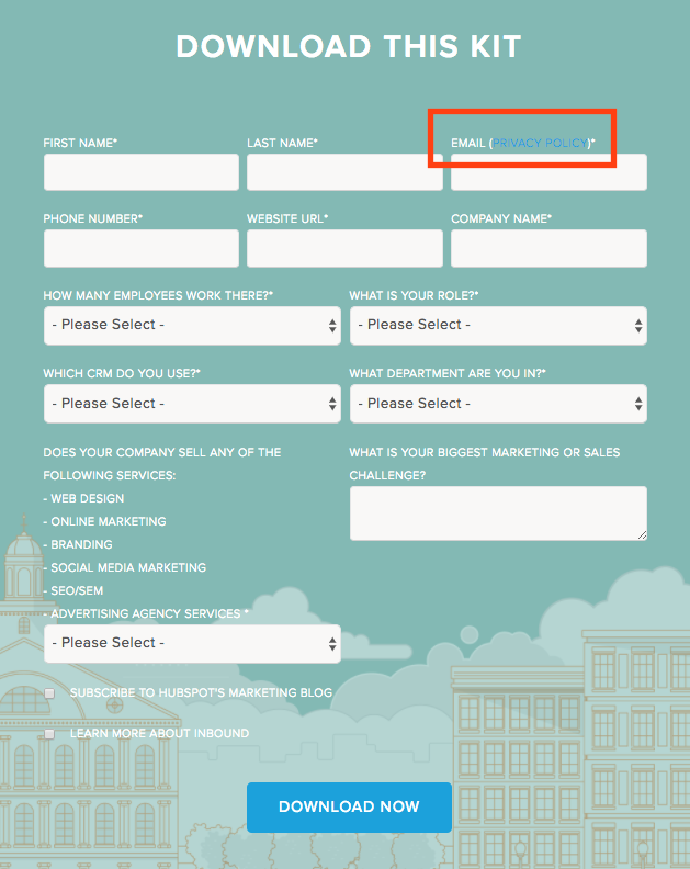
Of course, before you promise that you won’t sell their email addresses, make sure your company actually won’t. You need to be able to keep your promises to earn a reputation for credibility among your customers and potential customers.
7. Compelling Button Copy
The copy on your button is what what motivates and directs your visitors to take a desired action on your landing page. That’s why a word like “submit” is a bad idea. Not only is it too vague, but no one wants to “submit” to anything. You need to be more specific than that.
Instead, tell buyers exactly what they’re getting when they click that button. Use specific words like “Download Now” or “Download Your Ebook” for an ebook or white paper; something like “Access Your Coupon” for a discount offer; and “Sign Up For Free” for newsletters or free trials.

8. Social Proof
You can tell visitors as much as you’d like how good your offer is, but the truth is, it’s more compelling for them to hear about it from someone else. This is where social proof comes in.
Social proof is the positive influence created when a person finds out that others are doing something. If site visitors see that people who have consumed the offer are speaking positively about it, they are more likely to think positively about it, too, and therefore might be more likely to fill out the form and convert to a lead.
Social proof can take the form of:
- Customer testimonials: short quotes from happy customers
- Case studies
- Embedded social media posts
- Number of downloads, users, and so on

Using social proof on your landing pages can be a powerful addition to your marketing strategy. Read this blog post to learn more about how to add social proof to your landing pages.
Your Landing Page Checklist
Now that you’ve mastered the anatomy of a landing page, here’s a landing page checklist you can run through every time you build a new landing page.
- Does your landing page pass the blink test? In other words, will someone know what the offer is, why you’re offering it, and why it’s valuable after only 3-5 seconds?
- Do you have an attention-grabbing headline?
- Do you have a relevant and compelling image?
- Is the copy clear and concise? Does it explain what the offer is and why it’s beneficial?
- Have you removed potential friction and distractions from the page, like external navigation?
- Did you include a privacy policy?
- Did you add social proof?
4. A/B Testing Your Landing Pages
A landing page that follows all the tips from our first few chapters can still be improved upon. Every company and every audience is different, and only by A/B testing will you know you’ve made your landing page the very best it can be for your specific target customers.
The data you collect from your landing pages will actually help you make those and future landing pages more effective. Of course, that means you have to pay attention to your metrics. No one likes poring over spreadsheets, but it’s worth the trouble if you can bring in even more leads, right?
Here’s what you should learn from the data you examine:
- Where visitors clicked on your page
- How long visitors stayed on your page
- How many visitors converted to leads
Each of these metrics can be improved upon, but testing it will be the best way of discovering what works and what doesn’t. Instead of wondering if your headline is compelling enough, put it to the test against a different headline to see which leads to a higher conversion rate. Even the smallest tweaks can significantly affect the number of leads you can generate.Free Ebook: An Introduction to A/B Testing
In fact, when completed correctly – with an adequate sample size and time for the experiment – you could see a big boost in leads. Can you believe that even small changes like button color could make a difference that big? Everyone must be A/B testing if they could improve their bottom line by that much, right?
Unfortunately, 61% of businesses run fewer than five tests each month. Don’t be one of those businesses. When testing your landing pages costs next to nothing and is easy to implement, why wouldn’t everyone do it? All you need is the right software to uncover dramatic results from quick and simple changes.
Which Elements Should I Test?
Not all variables on your landing page will result in higher conversions. Some are actually more worthy of your time than others. If you’re wondering if you should change the background color on the page or change the copy, you’ll quickly learn with A/B testing which is more beneficial to your bottom line.
First, let’s determine which of the elements you can optimise through A/B testing on your landing page.
- Offer Type
- Copy
- Form Fields
Each of these can be broken down into smaller elements. Let’s start with the biggest effort test: offer type.
1. Offer Type
We’ve done a lot of the work to determine which types of offers work best for prospects in various stages of the buyer’s journey. You may need to test your own offers to determine which types work better for your customers wherever they may be on their journey.
Keep in mind that a balanced mix of content is important so that you’re reaching people at every stage of their buying journey. If you have plenty of content for first-time visitors (like checklists and ebooks), but drop the ball on offers that will convert those visitors into actual customers (like product demos and free trials), then your landing pages won’t do much to help you.
Now, if you want to determine which offers work best with different stages of the buying journey, you’ll just have to test them. You can promote these offers one at a time or do a split test. The first takes longer, but is less work up front. The second gets your job done right away.
To run this test, use the same research to create different offer types, like an ebook versus a webinar. Here’s an example of an ebook and webinar we ran here at HubSpot with the folks at Iconosquare:

Here’s the landing page for our ebook on Instagram for business.

Here’s the landing page for our webinar or ”hangout” on Instagram for business.
Simply change the offer type, and use an A/B testing tool (like the one built into HubSpot’s software) promote the offer to your audience through your email and various channels, with some buyers seeing one version and some seeing the other. The one that generates more conversions is the winner – for that particular stage of the buyer’s journey, of course. The offer itself might work better somewhere else with buyers who are further along in their decision.
In addition to types of content, you can also test different topics against each other. This also can be done one at a time, but a split test will give you a better idea of which topic is more compelling for your buyers.
2. Copy
The copy on your landing page can be broken down into various elements, from the headlines to button copy. Each of these smaller pieces can be tested to achieve better results – just make sure you’re testing them one at a time, otherwise you won’t know which copy change yielded the better results.
One test you can start with is short, snappy copy versus a long-form article on the landing page. You might find your audience likes longer copy, while some industries benefit from short, to-the-point information. And this may differ by the type of offer. We’ve also discovered that hard data and bullet points often work better, but you could discover the opposite through your testing.
You could also test including testimonials, quotes from review sites, press and other social proof to strengthen your position. A/B testing is the best way to discover if those elements help or hinder your conversion rates. Remember to test only one thing at a time though to be truly sure of what is impacting the results of your test.
3. Form Fields
We’ve already touched on using forms in various ways to reach buyers at different stages in the decision process. This chance to A/B test your forms will help you really hone in on what works best.
For top-of-the-funnel offers like ebooks and whitepapers, start with simple contact information. Content and offer forms targeted at folks who are considering making a purchase can ask for more information – but only what you need to help these prospects move further down the funnel. If you’re offering something at the bottom of the funnel (i.e. something for those who are ready to buy but just need a little more convincing), then it’s time to really dig deep for answers that will help you convert that lead into a customer.
The number of fields could impact the number of prospects willing to hand over their information, but don’t be too quick to cut fields. If you remove the most important questions just to increase the number of leads you gain, you still won’t learn what you need to provide the best education for those prospects.
By A/B testing your forms, you can determine which questions make buyers balk and which cause little-to-no friction in creating great relationships.
Now that you’ve got the big things out the way, there are some smaller elements you can test.
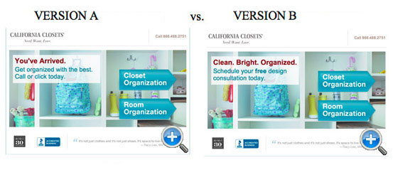
4. Headline
Do your buyers like witty, punchy, or clear and informative headlines? Maybe different language will work better to convert different types of prospects. A/B test to find out if more high quality sales leads convert when using a variation of a headline.
In the headline copy test below, version A increased leads by 115%.
5. Form Field Names
Could you be clearer with your form field names? If your buyers fill in their email address every time you ask for a home or business address, then you could probably work on clarifying things.
6. Button Color
You want the colors you use to both work with and stand out from the other colors on your landing page. Contrasting but also complimentary. Could you use another color that catches more eyes?
7. Button Size
If your buyers can’t find the button, how can they click it? Test different sizes to see which are large enough to garner attention without overwhelming the overall design. This is especially important for folks who land on your landing page on a mobile device with a smaller screen.
8. Button Copy
Here’s where you discover if “submit” works for you or not. (Hint: It doesn’t.) Some of the terms you choose could work better than others, though. Take some time to find out which gets your visitors to act.
Here’s an example of how the copy ”Get” versus ”Order” impacted conversion rates in one test:

9. Form headline
There’s more than one headline to worry about on your landing page. Make sure your headline of your actual form tells buyers what happens when they fill out the form. A few changes might be needed to get it just right.
10. Image
How relevant is your image? Knowing that 90% of people process images before words, you could get a big boost to your conversions simply by testing different images.
11. Font Size
You may want to experiment with your headlines and body copy to make sure you’re capturing visitors’ attention. A bolder headline with clear, larger-than-usual copy could be the combination that gets those leads converting.
12. Use of Video
Video could help you illustrate the value of your offer. In fact, some landing pages with video could increase your conversion rate. Consider trying landing pages with and without to see which ones perform better for your buyers.
13. Testimonials
Social proof is a big deal and could be very helpful on your landing pages. Or, you could find that the testimonials you include distract your visitors from the real goal: filling out that form.
Analyzing Your Results
Like all good marketers, you must track and analyze your results to know what’s working and what isn’t. Some of your metrics will be easier to track that others. For instance, you can see almost immediately how many people clicked through to submit their information. Where things get tricky is comparing the many variables you’ve tested to determine which bring the best results.
Fortunately, we have a free A/B Testing Calculator that’ll help you avoid doing complicated math manually. Use that calculator to help you determine the statistical significance of each change you made with just the push of a few buttons.
Applying Your Learnings
Statistically significant results should be implemented right away. The changes that brought in more visitors, converted more prospects to leads, prompted more information through the form fields, and resulted in higher sales – should all be added to your landing pages permanently.
Just remember: Your landing pages will never be perfect. Just when you think they are, you should probably start testing again.
Consumers are fickle. What prompts them to action today might annoy them tomorrow. The only way to keep your landing pages as fresh as your content is to keep changing things to reflect the latest best practices and trends.
Stage 5: Measure the Performance of a Landing Page
All the calculators in the world can’t tell you if your pages are performing well or not. It’s up to you to use landing page analytics to determine your reach, impact, engagement, and growth. We’ll start with the easiest to track and go from there.
4 Important Metrics to Measure:
1. Page Views
You’ll probably watch this number obsessively after launching an offer, so tracking views won’t be too hard. It’s important to note that this number tells you much more than simply how many people stopped by your landing page.
First, you’ll know if your page was promoted well. Would changes to your promotion efforts bring in more page views? Does your number jump after A/B testing different elements? What’s the ratio between page visits and conversions? That’s where you really start learning something about your landing page.
2. View-to-Submission Rate
Once you know how many people have visited your landing page, you’ll want to know how many completed submitted contact information. Keep in mind that several things could affect this ratio, such as the type of offer you’ve presented.
You’ll also want to consider your historical benchmarks to determine what’s working and what’s not. Do you know if visitors from different promotional channels, such as email, search, and social media, are more or less likely to convert than others? This will help you determine where promotion should occur in the future.
Various segments of your buyer personas may also be more likely to fill out the form on the first visit, too. Some may need to mull things over before returning to get your offer. Still others may not be moved at all by your ebook or discount.
Your timing is also important to note when contemplating your view-to-submission ratio. Evergreen offers on landing pages that rank high for a keyword in search engine results may see a much higher view-to-submission rate than newly launched offers that are seeing more traffic from social media.
3. Conversion Rate
Your conversion rate can be broken down into two different categories: new and returning. This tells you which offers are better for the top of the funnel—attracting new customers—and which work better for those in the consideration phase or who have already made a purchase.
4. Total Number of Leads
The total number of leads generated is the big number to look at here. This number lets you know your landing pages are optimised and your offers are compelling to visitors who are unfamiliar with your company or those who have never converted on a form previously.
Conclusion
By now, you should have the basics you need now to build powerful landing pages with a focus on conversion and building relationships with your audience. It’s important to study the anatomy of your landing pages often to ensure you’re keeping with the latest best practices and trends so you can maximize your lead potential even on older, evergreen offers.
Never stop working to improve, whether it’s through research, A/B testing, surveys – whatever you need to ensure you’re providing your visitors with the offers and information they need to make decisions about your products and services.
You’re ready to run now, so start bringing in those leads!